Thursday, March 29, 2012

Final Evaluation

During the creation of my avatar, I encountered a few problems. A few of these included, the colours, the facial features, some of the tools, finding pictures/photos to use and more. The problem with the colours, was finding the right colour to suit my avatar. I had to try out a lot of different colours to get things exactly the way I wanted them, and I also had to make sure that once the colours were blended into the picture, they remained the colour I wanted them to be. This took a little experimenting to get right, but I got there in the end. The colours that I had to experiment with were the blues for the face, hair and eyes. The facial features of my avatar also caused me to run into some problems along the way. In my second avatar, one eye was a lot bigger than the other, causing me to have to use liquify, which proved to be a bit difficult with enlarging the eye. But I got there in the end; I had to play around with it for a while until I got the look I was hoping for. I still believe that I could have done the eye a bit better if I’d had more time to work in. Another problem with the face was the blemishes and shadows, which also leads into one of my tool problems. Whilst trying to remove the shadows/bags under her eyes, I also removed some eyelashes in the process, meaning I had to switch to the clone stamp tool. Even though I had switched tools, I still had a bit of trouble with this tool, I had to keep experimenting with the flow of the tool until I finally got it right, making sure that the eyelashes still looked like they were there and hadn’t disappeared. Another problem I ran into was finding photos/pictures to put into my avatar. I had to search quite a few different things on flickr.com until I finally found something that I could use, that was fitting for the avatar and was copyright free. Each photo took awhile to find, but I am happy with the photos I have chosen to work with. I also had a few problems with the hair and uniform. The hair took a very long time, as there were a lot of wispy bits that I had to colour, which sometimes turned out to not look very good. It took a long time to do, but I am happy with how the hair turned out. The uniform was also tricky to do; I had to find a good colour that would blend in with the uniform well, which took a lot of experimenting. But I finally got it right. The problems I ran into could get a bit frustrating and hard but I worked through them and got the best result I could.

The planning and organization of my avatar helped a lot in the technical creation. If I hadn’t planned, I would not know what I was doing, and would not know what to do next. I had everything planned out, telling me what to do next and how to do it. If I hadn’t done this, then I would have gotten completely stuck and I wouldn’t have completed my avatar in time. The planning was a crucial part in the process of creating my avatar, and I wouldn’t have gotten very far without it.

The character profile given to us to fill out was very helpful in the planning and creation stages. It helped a lot in coming up with my character and getting my ideas down on paper in an organized way. Without this sheet, I wouldn’t have been able to keep my ideas organized and I wouldn’t have been able to get my ideas down on paper very well. It also helped me imagine my character exactly. Before I had the sheet, I could only imagine parts of my character and I didn’t think much about her personality, but now that I’ve thought about her more, I can imagine her exactly and I can also imagine her personality and how she would act towards other people and other personalities.

There were a couple of issues with my time management on this assignment. I spent a lot of time on my first avatar, getting everything perfect that I didn’t have much time left to work on my second avatar once the first was completed. I had about 3 weeks to work on my first one, and only one week to work on my second. To work through this, I took a laptop home from the library for a weekend, and worked on my avatar then, and I also worked a bit on my own computer (photoshop elements). My photoshop was a bit more limited and I didn’t have some of the tools I needed, but I did all the things that I could and worked on the other things during class. It took me less time to complete my second avatar, as I got the hang of using photoshop and new tools after I’d done my first one. I’m very happy with the results of my avatars.

I believe that I have completed a lot of reflections about my photoshop work throughout the term. I have posted all of my completed work on my blog and I have given detailed explanations on how I did them. This has helped me a bit with my avatar. I went back through my blog at times to remember how to do some of the things that we had already done. My reflections are detailed and I believe that I have done a good job on them.

I discovered a few skills throughout my work on my avatar. I discovered a few keyboard shortcuts that helped quite a bit and I also discovered how to use the magic wand tool. We hadn’t used the magic wand tool in class until I was making my avatar. The magic wand tool was easy to use and it was very efficient in getting rid of the green screen. The keyboard shortcuts also helped a lot, as I didn’t have to go back to the side bar every time I wanted to change tools, I could just press a button on my keyboard and the tool would be ready to use.

I am very satisfied with the final result of my avatar. I believe it has turned out well and is what I hoped it would look like. I would like to change a few aspects of my avatar. If I’d had more time and there wasn’t as much hair in the way, I would have liked to change what my avatar was wearing. I also would have liked to liquify her face a lot more, so she didn’t look quite the same as she did now. If I could start the whole project again, I wouldn’t do much differently. I would probably liquify her face a lot more and make her look a bit less human, I would also maybe change the colour of the top of her hair a bit as well, so it didn’t quite look so normal. I would have also liked to add in a bit more to the background and I would’ve liked to put a bit more texture on her face. I am very pleased with the progress I have made in photoshop. When I started out, I had never used photoshop before, besides a little bit in art, which didn’t teach me much. I’ve always wanted to learn how to use photoshop and I’m really glad I finally did! It’s a lot of fun working in photoshop and I’m very happy with everything I have learnt and I’ll be taking my skills into the future and using them a lot!

CHARACTER PROFLIE

Character Profile Worksheet

Basic Information/Statistics

Name: Annabella Arlen

Age: 14

Current Residence: Universe Baziba

Occupation: Water elemental

Talents/Skills: Controlling water, athletic, smart,

Physical Characteristics:

Height: 5”5

Weight: 40kg

Race: Bazibian

Skin Colour: Blue

Eye Colour: Blue

Glasses/Contact Lenses: No

Hair Colour: Blonde with coloured ends that
change colour with different emotions

Facial Shape: Oval

Distinguishing Features: Water texture in her eyes

Style (Elegant, shabby etc): Elegant

Dress/Clothing: Wears blue - resembles water element.

When working, she wears work uniform – Blue uniform shirt.

Mannerisms: Fidgets when nervous,

Hobbies: Practicing water magic, reading, drawing, adventuring/discovering

Favourite Sayings: “In deep water”,

Speech Patterns: (straight to the point, long winded): Straight to the point, modest, logical

Emotional Characteristics

Strengths: Water magic, Focusing,

Weaknesses: Too attached to friends and family

What motivates this character? Her friends and family

What frightens this character? The Aatami’s (Earth universe)

What makes this character happy? Her magic, family, friends,

Introvert or Extrovert: Extrovert

What is this Character’s Goal? To become an expert elemental

Intellectual/Mental/Personality Attributes and Attitudes

Educational Background: Arlyn High

Character's short-term goals in life: To become the strongest water elemental

How does Character see himself/herself? Strong, average

How does Character believe he/she is perceived by others? Viewed as confident, beautiful, outgoing and strong

How self-confident is the character? Not very confident

Does the character seem ruled by emotion or logic or some combination thereof? She is ruled by logic

What would most embarrass this character? Not being able to control or do part of her water magic

Best Characteristics: Modest, smart, athletic, beautiful, strong, logical

Worst Characteristics: Her height, she’s too modest sometimes, she protects her family too much

Does the character have any prejudices? She dislikes the elementals that tell her what to do, she also dislikes non-elementals.

Additional Notes on This Character:

Annabella’s hair tips change colour with the emotion that she is feeling, they are light blue, matching the water when she is happy, but they change to a dark blue/purple when she is sad. They also change to a bright blue when she is angry. Her universe works to help the Earth, she is a water elemental, meaning she helps control the water and weather that involves water on the Earth. Bazibian’s are assigned jobs when they turn 7, and they work on that job for the rest of their lives, some Bazibian’s are assigned jobs within the universe/kingdom. Annabella was assigned to be an elemental, as she had great promise in magic. The school she went to was an elemental school, where she learnt how to control the water. The earth universe is the one she is most afraid of, as water can be absorbed by the earth. The earth universe controls all the earth elements on the earth. The colour of her skin also changes slightly as her emotions change. The blue colour goes a bit darker when she is sad, lighter when she is happy/normal and lighter still when she is angry. There are also three other universes, the fire universe, air universe and spirit universe. These also help to control the earth and help balance everything.

Sunday, March 25, 2012

Completed Sad Avatar

This lesson, I completed my second avatar. I used a feathered brush to to soften the lips, and coloured over a few green bits that were left over from the green background. I also coloured a bit more of the hair that I had missed, which I then changed the opacity of so the hair was more visible. I also softened up the hair a bit more. I am happy with my completed avatar.

Sad Avatar 3

I kept working on the second avatar this afternoon. I worked on the uniform and lips today. I coloured the uniform a light blue colour and blended it using a blending mode. I used a mask to complete the colour of the uniform. Once the uniform was completed, I started to change the colour of the lips. I changed the colour to a purple and used a mask to get the shape of the lips. I then used a blending mode to blend it in.

Sad Avatar 2

In this lesson I continued work on my second avatar. I started by using liquify to enlarge the left eye, as it was smaller than the other one. After this was complete, I started to put the water texture in the eyes. I changed the eyes to a blue colour first, and then I added in the texture. Once the eyes were complete, I moved onto the colour of the face. I made the face a darker blue colour than the first avatar I worked on, as this emotion is sad. I used a mask to get rid of excess blue and completed the face. Once the face was done, I started on the hair. I painted it a dark blue colour and then used a mask to get rid of the extra colour that was not needed. Once this was done, I changed the blending mode so the hair changed to a purplish colour, I then used a feathered brush and softened the top of the coloured area. This made it look a bit more realistic. This is all I did this lesson, but I'm happy with how it's going.

Second Avatar

This is the image I have chosen to use for my second avatar. I am going to use it for the sad emotion. There are a few blemishes that I want to get rid of and a lot of dark shadows on her face. I am planning on getting rid of these. Because the emotion is sad, the hair is going to be a purple colour and the skin is going to be a darker blue.

Sad Avatar 1

This is my second avatar. Today, I started by cropping the image and adding in the background that I made awhile back. Before I added this, I used the magic wand tool to delete the green screen and then added a mask to delete any green left over. I then selected my blue background that I had made and copied it onto the image of Georgina. After I had done this, I deleted anymore green that was left on the image. I also did some touching up on her face. I used the healing brush to get rid of freckles and other blemishes that were on her face. I then used the clone stamp tool to get rid of the shadows on her face. The shadows were under her eyes and along her cheeks.

Thursday, March 22, 2012

Avatar 8

Today in class, I decided that I didn't like how I had done my uniform, so I changed it. I also thought that cropping the image would be easier and look a bit better, so when people looked at it, they would focus more on the face. Once I had cropped the image, I started to colour the uniform. I coloured it a blue colour and then changed the blending mode. I had to use masks and folders to get rid of excess colour and organise my layers.

Avatar 7

I took a laptop home on the weekend and worked on my avatar at home. I started to change my uniform to a different colour and change the symbol on the uniform to a different one, so it didn't show the St Hilda's symbol. I started by finding another symbol on flickr that had to do with water and decided on this one. I then shrank it and put it in place over the St Hilda's one. I then skewed it so it looked a bit more realistic and so it looked like it was sitting on the uniform. After this was completed I changed the blending mode so it looked a bit more real. Once I was done with the symbol I changed the colour of the uniform by colouring it in, then using a mask to rub out excess colour. I'm not very happy with the uniform colour and how it's set out, I think I may change this next lesson.

Tuesday, March 13, 2012

Avatar 6

Today in class I continued to work on my avatar. I found a tutorial on the internet that taught me how to make bubbles in photoshop, which can be found here:

http://csscreme.com/tutorials/photoshop-tutorials/simple_bubbles_in_photoshop. Once I had completed my bubbles, I copied and pasted three of them onto my avatar, I then used a mask to rub out some of the excess background that was attached to my bubbles, and I then made them an appropriate size and used overlay to blend them into the background. I also spent a little big of time on the face, changing the colour. I also searched for some things on flickr, such as zips and things to cover up the school uniform. I am planning on possibly changing the colour of the lips and getting rid of the uniform soon.


Playing Around

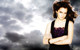
Tonight I played around a bit with photoshop. I got an image of Emma Watson (off google) with a white background a played around with it in photoshop. I started off following a tutorial. I deleted the white background and put in some dark clouds instead (image found on google). I then used the dodge tool set on highlights and with an exposure of 15%. I used the dodge tool on her eyes to brighten them up. Once I'd done this, I made a new adjustment layer and I made Emma Watson look darker. The tutorial got pretty hard after this, so I decided to stop and just see what I had, which I think looks pretty cool. I'm going to play around with a few other tutorials in the next few days and do some easier ones.
The tutorial I was trying can be found here: http://csscreme.com/tutorials/photoshop-tutorials/cinematic_poster_photoshop_tutorial

Experimenting


Today in class, I experimented with a few photoshop tutorials that I found. The website can be found here: http://www.hongkiat.com/blog/40-cool-abstract-and-background-photoshop-tutorials/
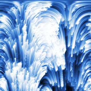
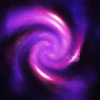
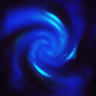
This website is very helpful with making some cool backgrounds for my Avatar. In class, I experimented with two of them that I though I might be able to use on my avatar. The first one looks sort of like water and I think I might use that one fore the background of my second avatar. The purple swirl was a fun one to make and it looks very cool. I followed the tutorial for this and created the purple one. But as my character is a water elemental, I decided that if I was going to use it, I had to change the colour of it, so I changed the colour to blue in photoshop. I did this by opening the purple version in photoshop, then creating a new layer which I painted blue. I then used blending modes to create the blue effect. I believe this turned out well, though I don't know if I'll be using it on my avatar. I am also experimenting with a few tutorials at the moment that are teaching me how to create bubbles from scratch in photoshop. The one I have found is very helpful so far. I will post the completed result of my bubbles when I have finished.

My Avatar 5

In todays lesson, I continued work on colouring the face of my avatar. I worked on colouring her face today. I kept experimenting with different colours that I thought would go well on her face. I ended up choosing this blue colour and using blending modes to blend the colour in with her face. I coloured the face on a new layer and then turned the opacity down and added a layer mask, which I then used to rub out all the blue I did not need in the picture. Today I also spent some time on flickr, trying to find a good texture to use on my face. I am still yet to find one, I have decided that I am going to use a photoshop tutorial to make my own bubbles, that I may use to put on her face. I also spent some time experimenting with a few tutorials to get the hang of it.


Monday, March 12, 2012

My Avatar 4

In todays class, I finished off the hair of my character and moved onto the face. I have been experimenting with colours that will go well on her face and I have been trying to find one that I am happy with. At the moment, I have this colour on her face which I am currently trying to rub out and blend into her face, I am quite happy with this colour so far. I experimented with colours for half of the lesson, and for the other half, I was on flickr. On flickr, I searched for photos of textures that I could put on her face and that could be blended in well. So far, I have not found one that I am happy with, but I am getting there. I am very happy with my avatar so far, and next lesson, I am planning on completing the colour of her face and adding a texture onto her face, and I am also planning to start trying to get rid of the school uniform.

My Avatar 3

Today in class, I continued working on the hair, which again, took most of the lesson. I continued to rub out the bits of blue that are not needed there and I had to add in a lot of bits as well, I had to zoom in very close to get the thin strands of hair painted in. Whilst I was doing this, I turned the opacity right back up and blended the colour in with a blending mode, which turned out to be hue. I really liked the colour this made, as it was a very nice blue and it suited my character very well. Once I had blended the colour, I went back to trying to rub out and add in the hair. Whilst I was doing this, I also began to think about how I am going to get rid of the school uniform and what texture I am going to put on her face.

My Avatar 2

Today in class, I started changing the colour of the tips of Georgina's hair. In my character profile, I stated that her hair colour changes with her mood, but as she is happy in this particular image, her hair colour will stay blue at the tips. At the moment I am trying to colour the tips of her hair. I created a new layer and painted a blue colour over her hair and turned the opacity down and added a mask so I could start getting rid of all the blue parts that I don't need. This is taking awhile. I need to zoom in a lot to get rid of tiny parts of blue that I don't need on there. I will continue working on this next lesson. I have also been putting all my layers into folders, as I am starting to get a lot of them, this is helping me keep them organised and easy to find.

My Avatar 1

In todays lesson, I worked on putting a background behind Georgina and changing her eyes. First off, I deleted the green screen behind her, and replaced it with an image of a reef that I found on flickr. I used a mask and brush to do this. It took a while but I finally got there! After
I had done this, I started on her eyes. I searched
for some water textures on flickr and I found a good one that I could place inside her eyes so that it had the image of water in them. To do this, I firstly had to change her eye colour. Georgina's eye colour was originally brown, so first off, I had to change them to blue. I created a new layer and painted a blue colour over her eyes. I then turned the opacity down and used a mask to get rid of the excess colour. After I had done this, I turned the opacity right back up and played with the blending modes. I ended up using Hue to blend the blue colour in with her eyes. Once I had finished changing her eye colour to blue, it was time to put the water texture in them. I opened the water texture image in photoshop and used a selection tool to select part of it, which I then copied and pasted over onto my avater. I placed this piece of texture over Geo's eye and turned the opacity down and used a mask once again to get rid of the excess picture. I then used a blending mode to make the water look like it was really inside her eye. I then repeated all this with the other eye. Today was a productive lesson and I'm very happy with what I have done so far with my character.

Georgina

Georgina is my model for our avatar assignment. This is the 'happy' picture of her that I am going to work on. Her character is a water elemental, so I am planning on putting her in an underwater/beach background. I am also planning on turning her eyes blue and putting a water texture in them and turning the tips of her hair blue. I am also going to put a texture on her skin, which I haven't decided on yet. I may also use the healing brush and clone stamp to fix up a few spots on her face and I may also use the liquify tool to reshape some of her face. I am also currently trying to figure out a way to get rid of her school uniform! I'm sure I'll think of something soon!

Backgrounds for my avatar


These are the backgrounds I collected for my avatar! As my avatar is an underwater/ water elemental, I decided that I should put her in front of a reef or on a beach or something like that. So I collected a few photos to choose from.

My Brushes


These are my brushes that we made in class a while ago. We had to draw a random picture to turn into a brush, so I chose a lightning bolt (because I'm a bit Harry Potter obsessed). After we had made the brush, we played around with the scatter, angle and other settings and had a play with it as you can see in the picture above. It was a very fun lesson and it is an essential skill for me to learn, so I'm glad we did!

Justin Bieber Zombie


This is my Justin Bieber zombie. In class, we had to choose a celebrity and do whatever we wanted with them. So because I don't like Justin Bieber very much, I chose do to him and turn him into a zombie. First of all, I went on flickr and searched for a zombie skin texture and found the one above. After I had found this, I saved it and opened it in photoshop. I then selected part of it and pasted it onto the picture of Justin. I then changed the opacity levels so I could see slightly through it and I applied a mask. I rubbed out the excess parts of the texture that I didn't need and that weren't covering the face and I rubbed out the eyes, mouth and eyebrows. I then turned the opacity right back up and changed the blending mode until one made it look right. I ended up using hue for this part. To improve the skin texture, I think I could have rubbed off the texture where the bandaid were on his fingers. I should have also covered a bit more of his hand. I missed a part of his hand with the texture and this should have been covered. After I did the zombie texture, I moved onto the hair, which I had decided to make grey. I painted the hair on a new layer and turned the opacity down again, so I could rub out all the excess grey they I didn't need. Once I had done this, I turned the opacity back up and played with the blending modes again. I also used hue on this, as it blended the grey in well with the hair. Once the hair was done and I was happy with it, I started to change his eye colour. I changed his eye colour to red. I once again painted them on a new layer and applied a mask, which I used to rub out the red that wasn't covering the eyes. Once this was complete, I played with the blending modes again and decided that soft light made the eyes blend the best with the red. I believe that a background would have completed the full effect of 'Zombie Bieber', but I didn't have enough time to put one in during class, as we were moving onto another task. Although there is no background, I still believe that 'Zombie Bieber' turned out well and I am very happy with it.

Crazy Hermione!

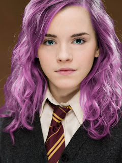
This is my crazy Hermione that I did in class. We were told to change her hair and eye colour and do whatever else we wanted. So I changed her eye colour to blue/green and her hair to a bright purple colour. This was a lot of fun to do! First of all, I did the eyes. I painted in a blue/green colour and placed a mask on the layer. I then painted out all the excess colour that I did not need. After this was done, I changed the blending modes and tried out a few different ones to see which one worked the best. Hue worked the best for this particular part of the piece. After I had done this, I copied the layer and deleted the mask. Once the eyes were done, I moved onto the hair. The hair was a lot harder, because there are a lot of wispy bits and gaps between all the hair. Firstly, I created a new layer, and coloured over her hair in the purple colour. I then created a mask and started to rub out all the excess colour. This took quite a bit of time, as I had to zoom in a lot to try and get some detail on it. I didn't end up putting too much time and detail into the hair, as I had to move onto another project, but I still did try to do as much as I could. I also touched up her face. This included getting rid of the pimples on her face and the shadows that were under her eyes. I also touched up her eyebrows a bit and got rid of some bits of hair that were covering her face. I did all this using either the healing brush or the clone stamp tool. These tools are very easy to use and it didn't take me long to fix up all of these things. When I was getting rid of the shadows under her eyes, I had to use the clone stamp tool, as I needed to change the flow. Lowering the flow made sure that I didn't get rid of too much of the eyelashes whilst I was taking away the shadows. If I had kept the flow right up, or used the healing tool, the eyelashes would no longer be there and it wouldn't look realistic. At one stage, I tried to change the colour of her tie from Gryffindor to another house, but this wasn't working and I didn't have any extra time to work on it, so I left it as it was. I had to get rid of some of the shadows on her uniform as well, I did this using the healing brush. This was a very fun task to do, as it kept my skills up in photoshop and I got to experiment a lot, even if some things didn't work.

Thursday, March 8, 2012

Beagle Puppy Happy - Before and After


This is the same as my other beagle puppy, only on this one, I made the beagle happy instead of sad. I studied a lot of happy pictures and studied how peoples faces changed when they were happy and what they looked like. I saw that their eyes go a bit bigger and their mouths turn into a smile. So I opened the beagle picture in photoshop and I went into the liquify tool. In liquify, I used the bloat tool again, as I did in the sad beagle puppy, and I made the eyes slightly. After I had changed the eyes slightly I moved onto the mouth. I again used the pucker tool, but this time I pulled the corners of the mouth up instead of down. I had to redo this a few times as I couldn't get the mouth to sit right, but I got it right in the end. I think that this emotion didn't turn out as well as the sad emotion as on the sad one the eyes and mouth both stood out quite a bit and they both contributed towards the sad factor. But in this one, the eyes may be a bit too big and the mouth isn't very noticable. I could have put a smile in the mouth in this one, but I didn't have much time to do this, so I just turned the mouth up into a little smile. Even though this emotion wasn't as effective as the sad one, I still believe that I made the beagle look at bit happy.

Beagle Puppy Sad - Before and After


This is my beagle puppy. In class, we talked about emotions, and how we can change them in photoshop. Our task was to make an animal of our choice have different emotions. We did this using the liquify tool. At first, I just played around with the liquify tool for awhile and got used to it so I could work on this task properly and efficiently. Once I was quite confident with the tools in liquify, I began to make my beagle puppy look sad. I did this by making the eyes bigger and turning his mouth downwards slightly. Firstly, I went into Filter, then into liquify. In the liquify tool, there are a few different tools to choose from. I studied some pictures of people and animals looking sad and that gave me ideas on how to change my beagle so it looked a bit sadder. Once I was in liquify, I used bloat to make his eyes bigger. Making the eyes bigger gave the effect that he was pleading. In a lot of photos or cartoons, the writers/cartoonists make the eyes go a lot bigger when the character is about to cry, this shows quite clearly that the character is sad. As the cartoons do this, I did this to my beagle as well, and it had the desired effect. Once I had completed the eyes, I moved on to making the mouth look sadder. When people are sad, they frown and their mouths go down. So I decided to try and make it look like that's what happened to my beagle. To make it look like this, I used the pucker tool and pulled the edges of his mouth down. I believe that it worked and I am quite happy with how it turned out. The mouth of the beagle did go down and it made the beagle look a bit sadder. Together with the eyes, the beagle emotion had changed. I believe that I succeeded in making the beagle puppy sad.